
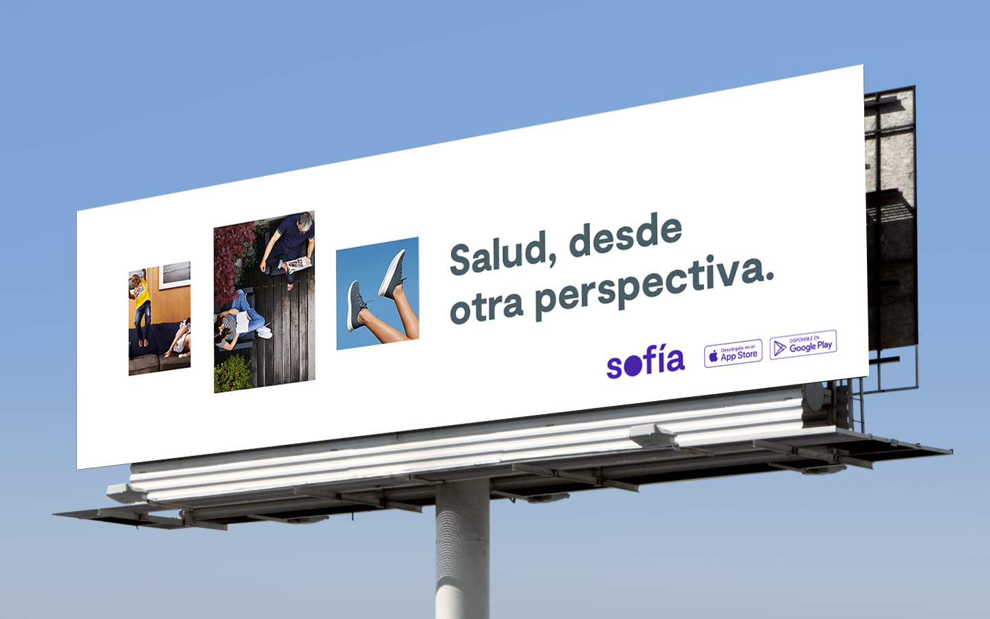
A brand to break old industry perceptions
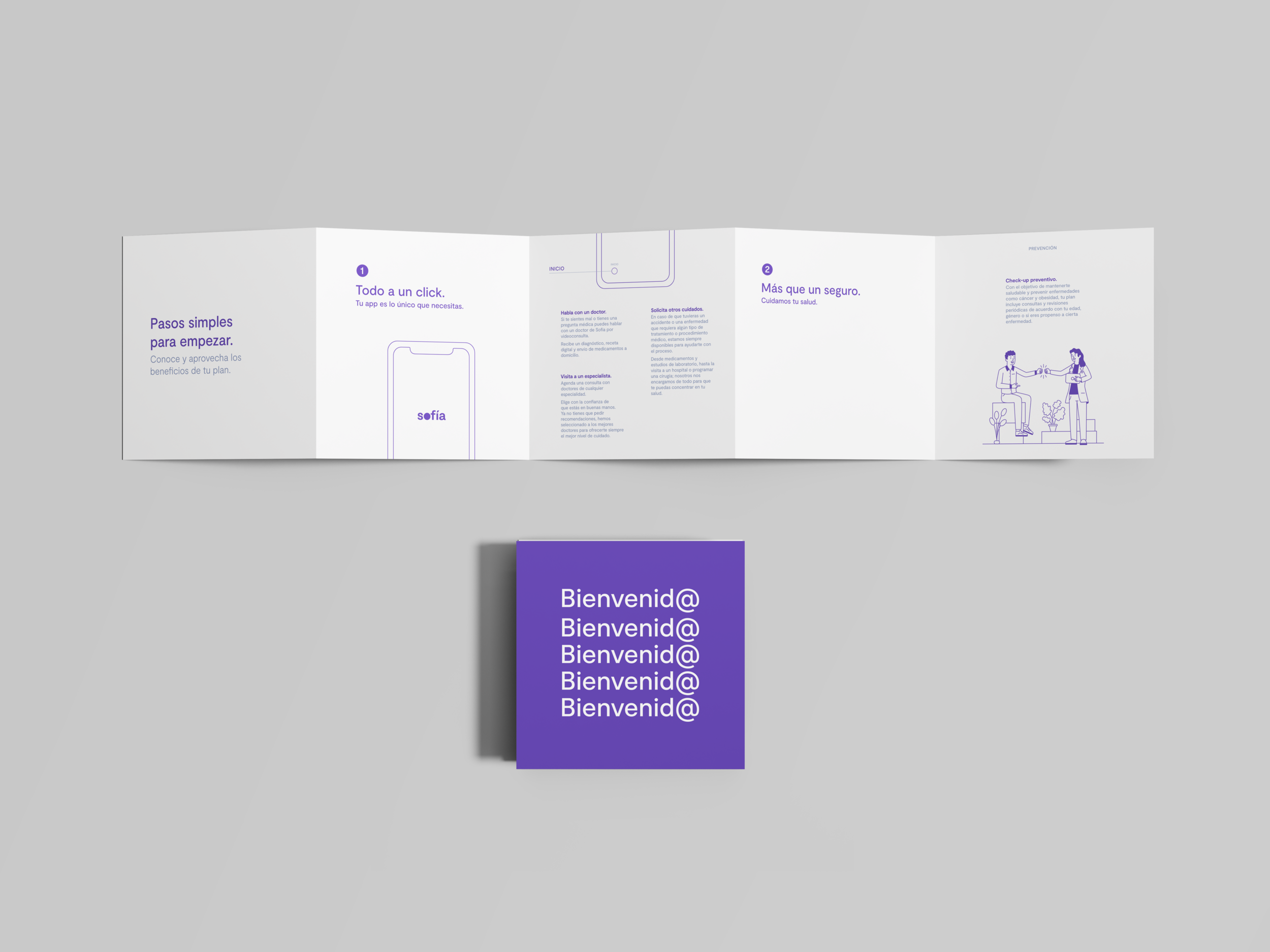
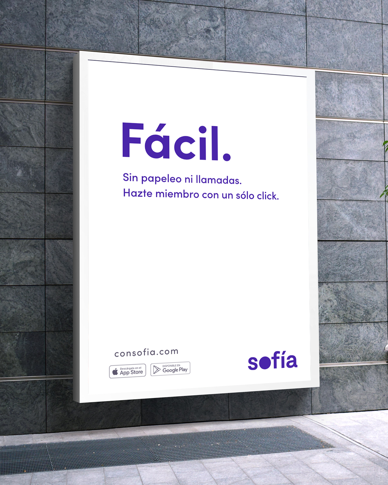
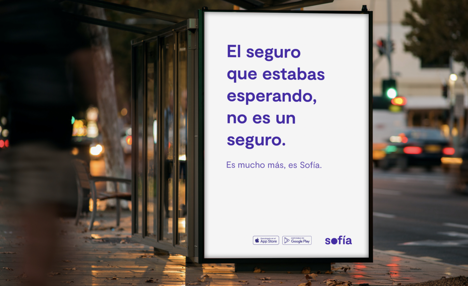
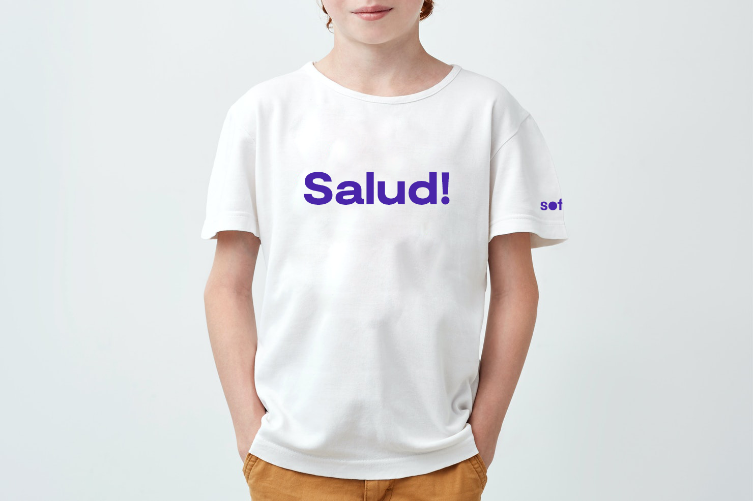
Sofía is radically different from any health insurance company in Latin America. The brand is all about innovation and people. It voices a young, rebel and creative spirit with a simple, honest and human message.

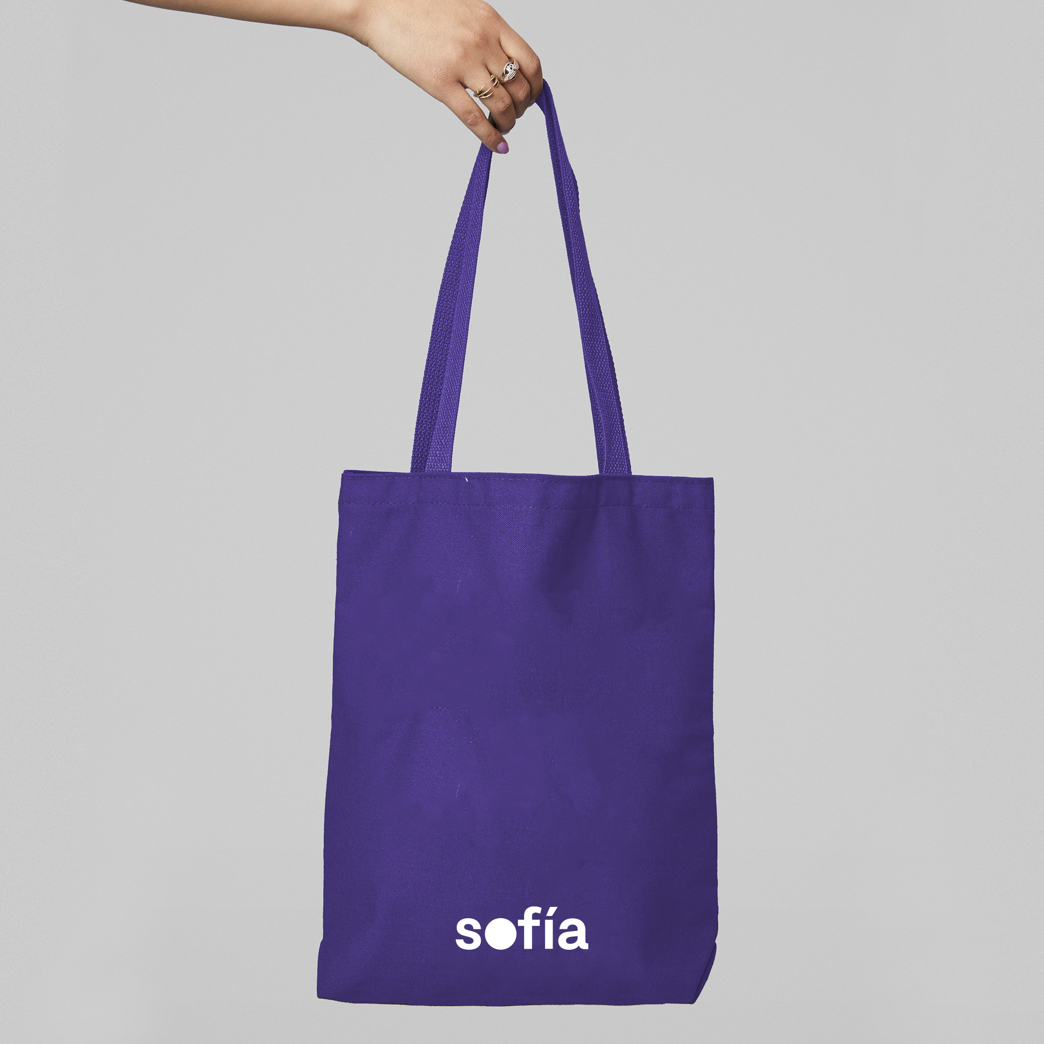
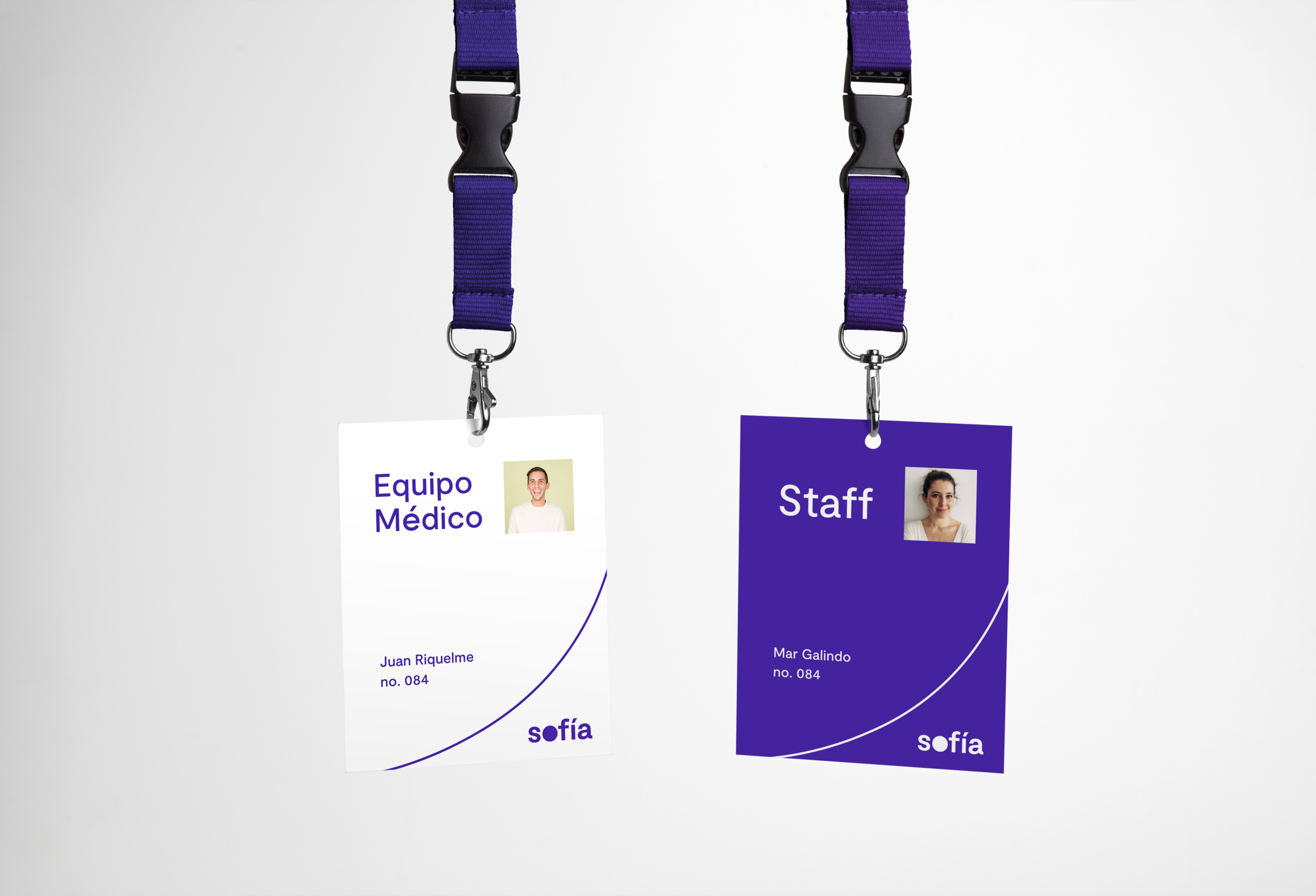
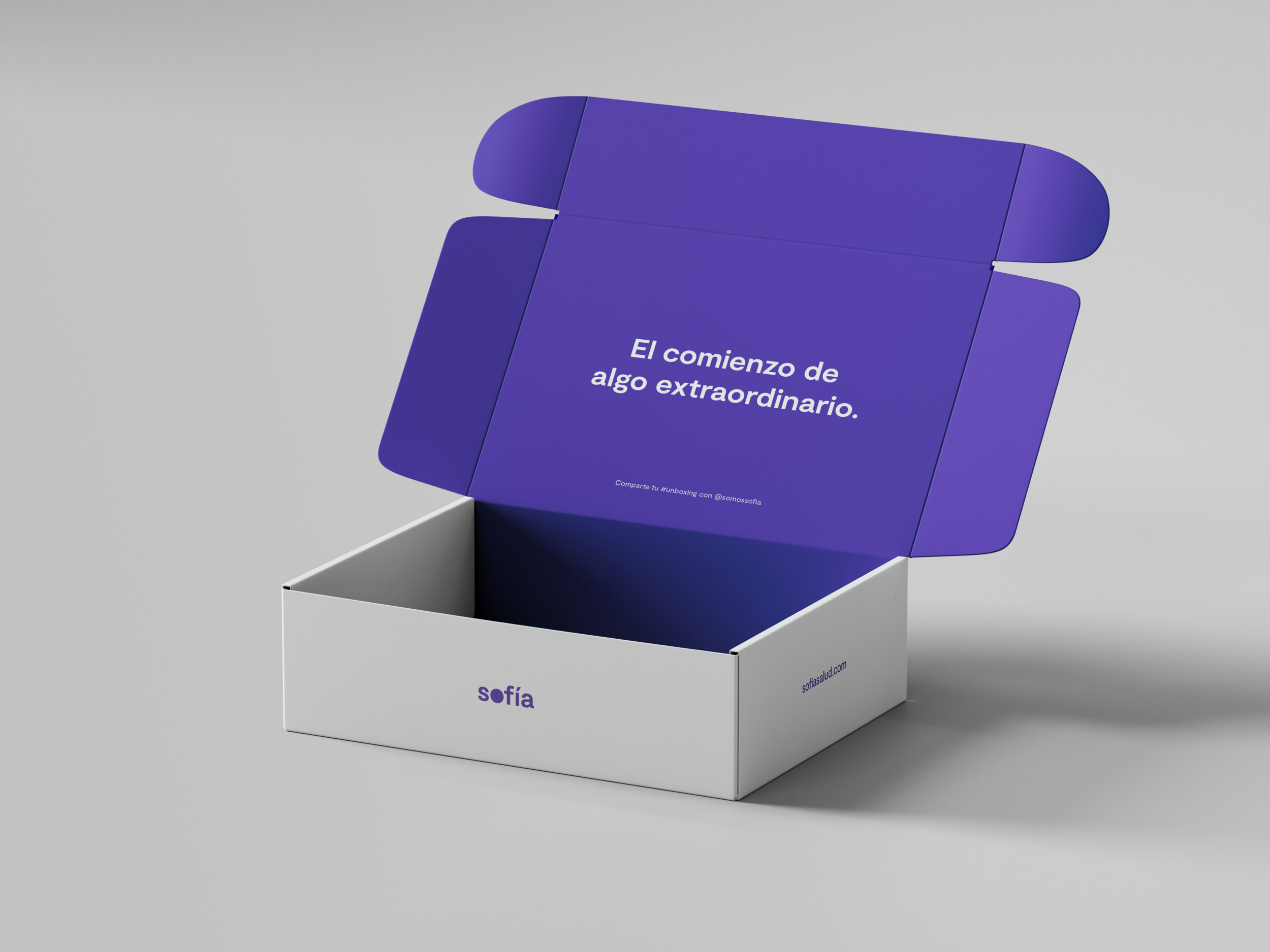
Behind the logo
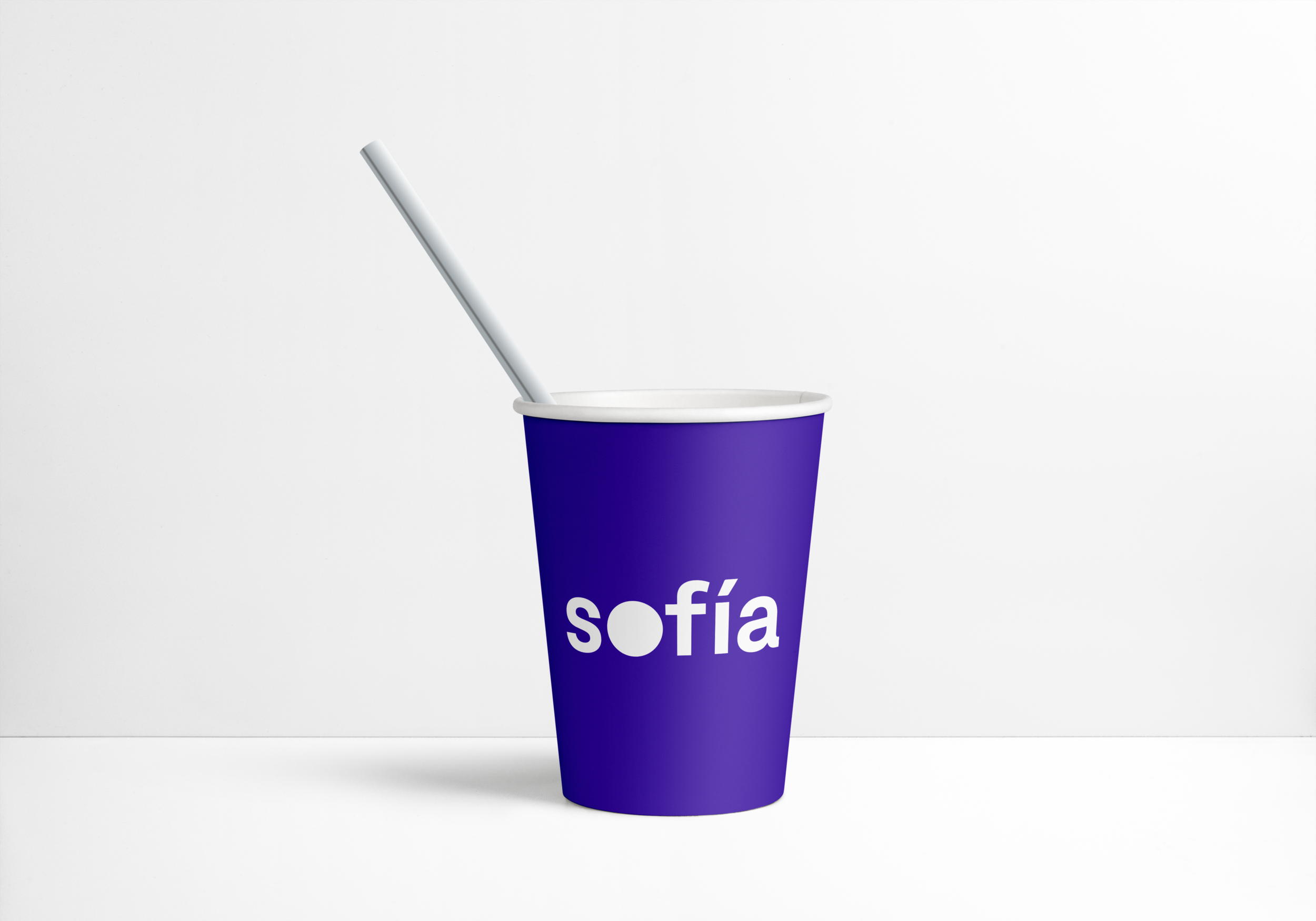
This was one of the hardest logos I've had to make. From the start I knew I wanted it to be a wordmark because the name Sofía was very strong and very different from any other health insurance company in México. I wanted the name to be the hero and the brand to be recognized in that way.
On the other hand I did want to be able to condense it to a simple mark to use on social media or as the app icon. I thought it would be the letter 's' but the 'o' ended up being the star.

The circle, a symbol for a movement
The circle embodies wholeness, reliability and movement. It's the antithesis of a square, rigid, closed-minded insurance world. The mark is based on Moderat, a typeface with a timeless and familiar feel. It's refined and sophisticated (we see it in the a) without feeling unreachable. All the letters are in lower case to differentiate from a real name and to convey friendliness. The purple represents wisdom (Sofía in latin is wisdom), ambition and abundance.

Square vs circle concept by Alberto Montalti.
Documenting the brand essence
The Sofía Brand Book is the essence of the Sofía brand condensed in a single website. It contains the foundation, values, mission, assets and the vision for the brand. It’s the longest I’ve worked on a single brand and therefore it is the broadest and deepest brand document I’ve ever created.

Coming soon
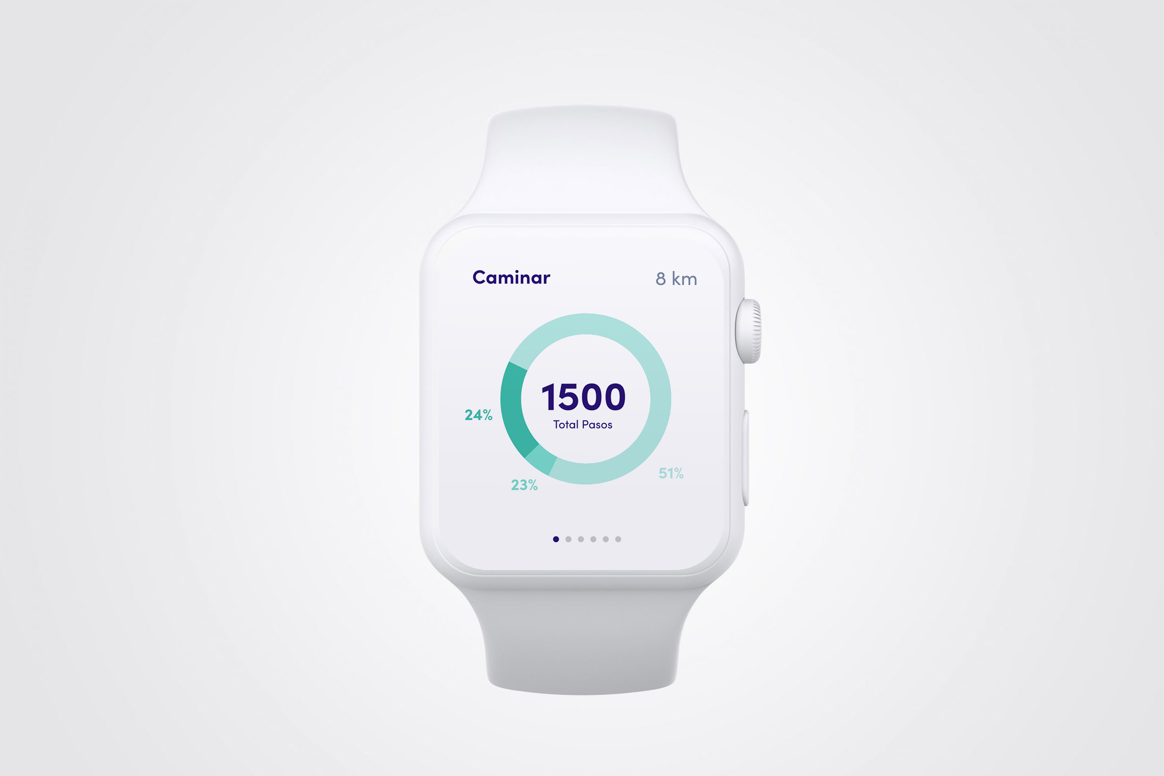
Designing a digital-first health insurance for Latin America. How we went from whiteboard to product.